One foot in the house, one foot in the garden.
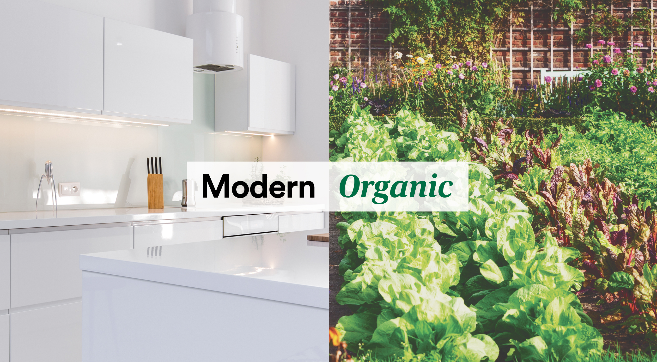
Whole Foods Market’s new brand aesthetic is based around the balance of modern and organic. Modernity is created through bold typography, structured grid layouts and white space. Fluid organic elements like a curvy serif typeface, illustrations and photography are incorporated into this structured system to serve as a foil to modern.
Type lockup exploration
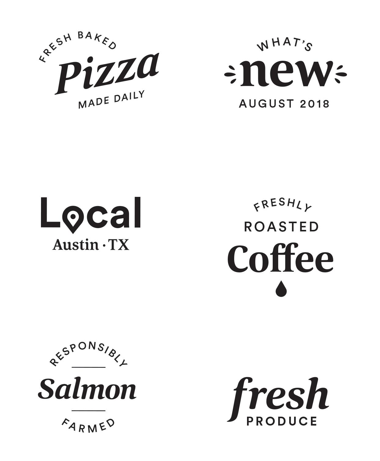
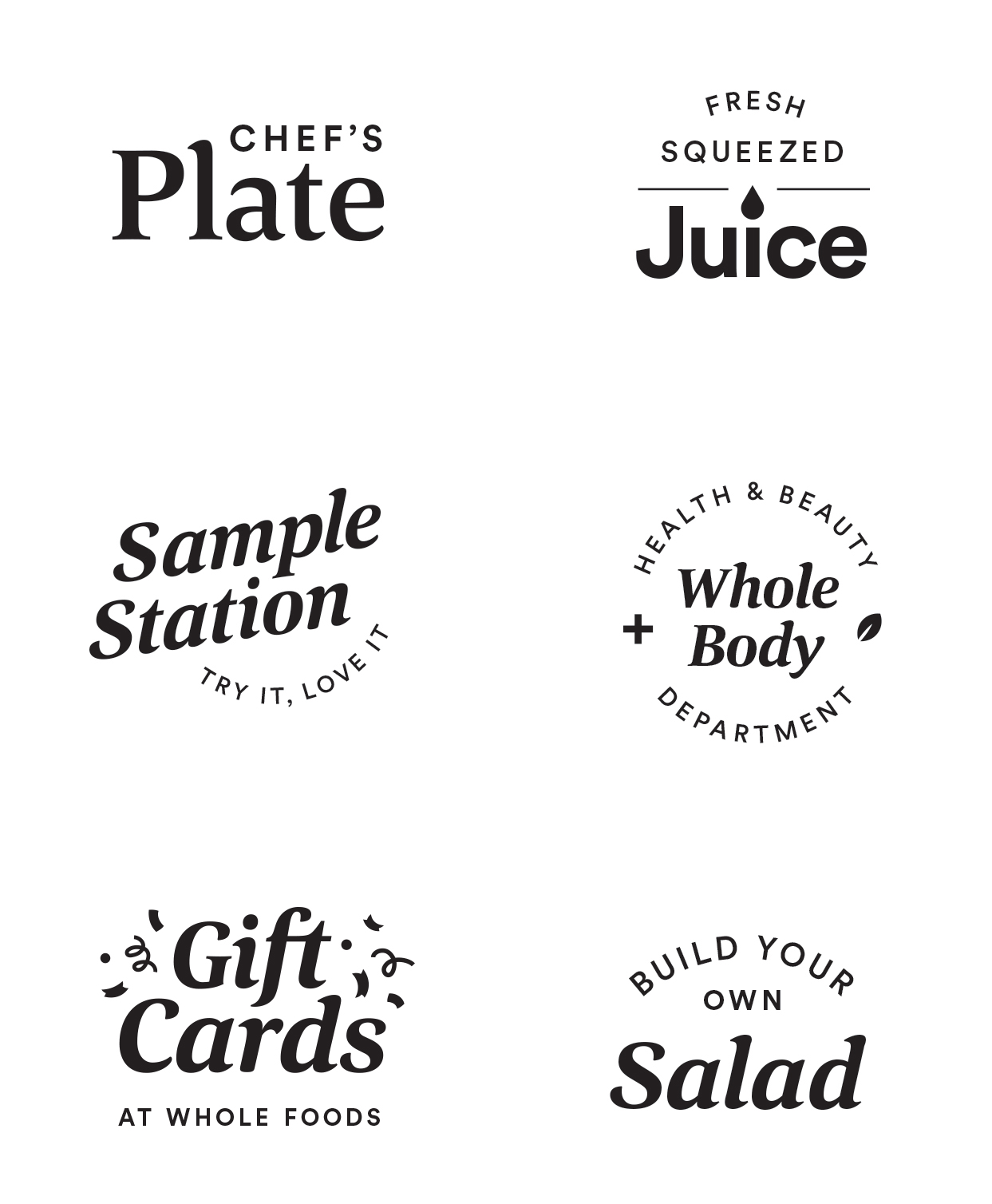
Our new serifed secondary font, Corda has a traditional feel to it with playful curves reminiscent of sign painting. I developed standards around when and how this secondary font gets used. In most cases like store signage and digital applications it plays a secondary role but on occasional instances, like in our sub-branded logos, it can play more of a hero role. The set of marks below is an exploration of type lockups using our two brand fonts to test how an identity system of interrelated logos could hang together.
Layout Exploration
Below explores how our two fonts live together in a layout environment with playful illustrations incorporated. Through user testing we discovered that black type on a white background stands out most and catches the eye of our shoppers amidst the colorful clutter of the grocery store. This clean looks stands us apart from other large grocery retailers.
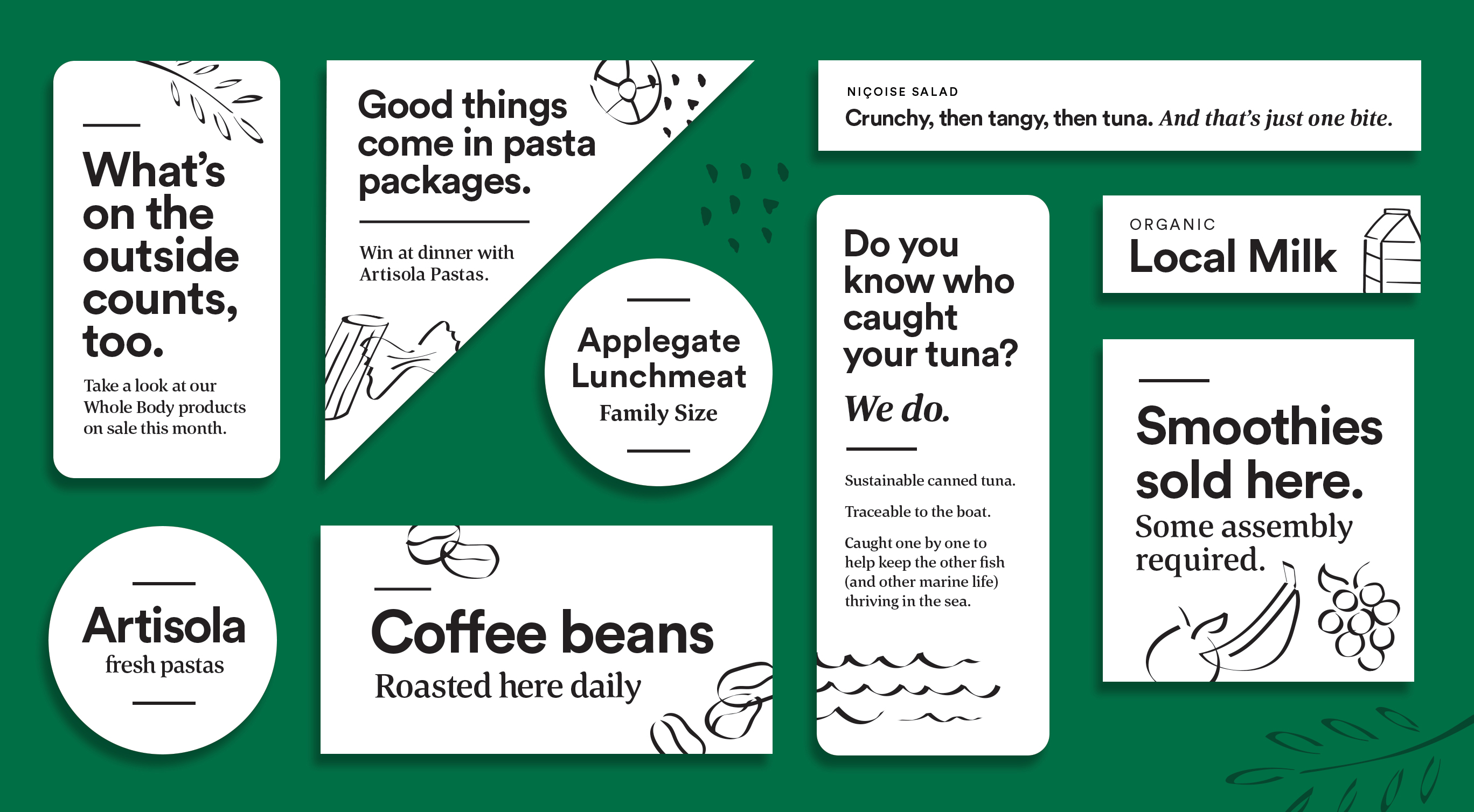
Illustration Style
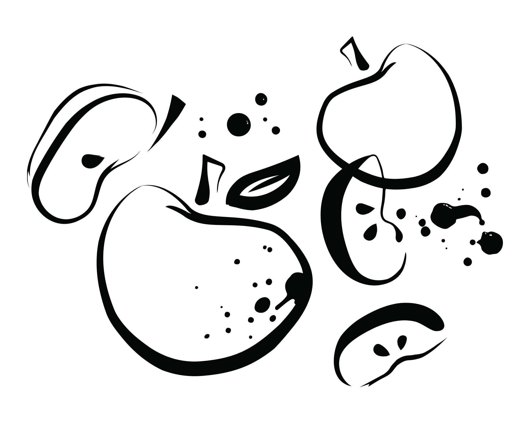
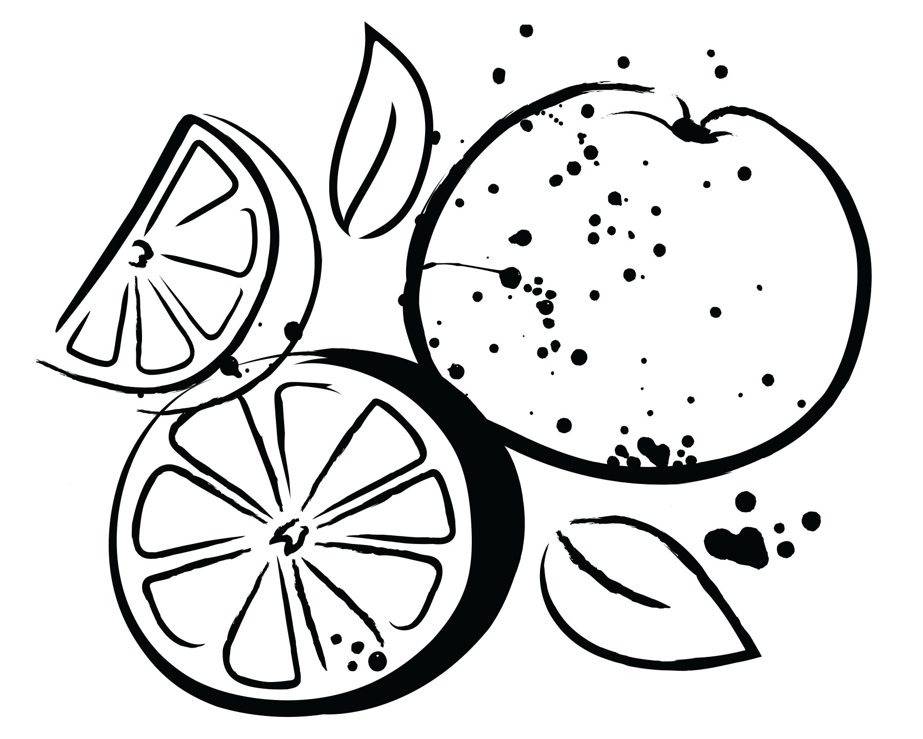
After an extensive exploration phase, the illustration style we landed on is gestural, inky, playful and elegant. It’s the perfect “organic” complement to the “modern” type and layout structures within our design pieces.


