


Old to New
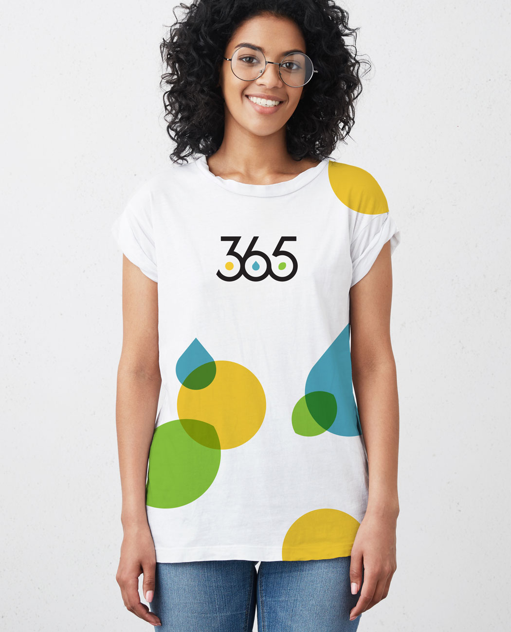
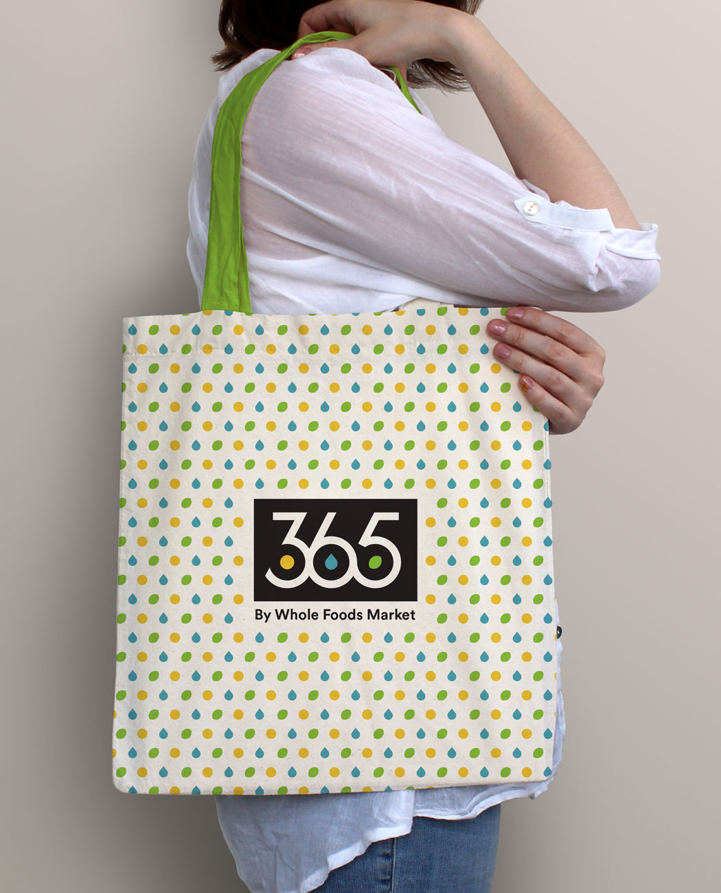
In order to avoid confusing the current 365 by Whole Foods Market customer, I kept a few key elements from the old logo, including the iconic black box, white typography, bright pops of color and icons derived from nature. This ensures a smooth transition from old to new branding.
The Icons
The circle motif references the repeating yearly cycle (365 days a year) as well as the cycle of nature. Rather than literally depicting the 4 seasons of the year, the new icons take a more holistic approach indicating that 365 by Whole Foods Market offers products that will nourish you for the rest of your life.

Illustration


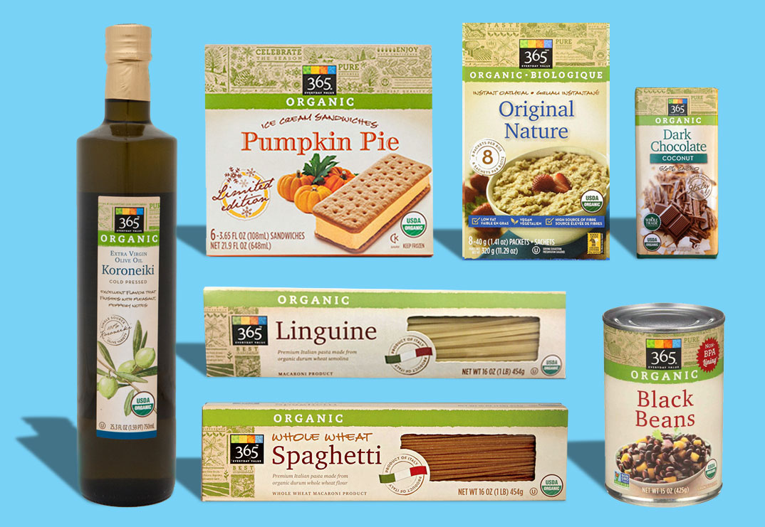
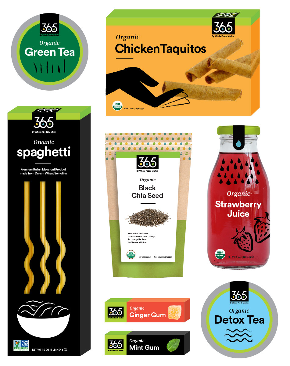
The Packaging Problem
The current 365 brand packaging doesn’t stand out on the shelf. The designs are traditional and blend in with other products offered at the store. While the current designs convey the idea of organic and healthy they lack a sense of playfulness.
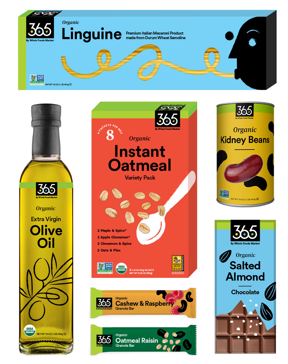
The Solution
Inspired by Saul Bass and Matisse, the new packaging is colorful and fun to appeal to a younger design-conscious audience. I felt it was important to keep the lime green bar graphic that denotes “organic” in the packaging design because customers are used to looking for that while shopping.
Environmental Signage